 BUDDHA, done with a white colored pencil and with one Rainbow Lead Multicolor pencil for shading. BUDDHA, done with a white colored pencil and with one Rainbow Lead Multicolor pencil for shading. Warning: If you're not interested in a nerdy essay about using a pencil with a multicolored lead, please skip right past this post. You may require the patience of Buddha to read it... 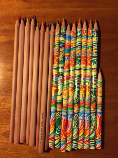 Several readers have asked me questions about using multicolored pencils, since I often use them for drawings and/or tangles posted here, so here is a piece on the topic. It's a long post, but the longest part is about where and how to find the pencils. That is a big issue. The short part of the post is about how to actually use them, because what I know about using multicolored pencils can fit into a thimble. You can see my current stash in the photo to the left. I only own 2 kinds of these pencils at the moment. I'll explain that shortly. WHAT *ARE* THESE MULTICOLORED PENCILS, ANYWAY? or..."I've never heard of them." Let me start by saying, let's call them something else. Let's call them "Rainbow Lead Pencils," or "Multi's." As you can see from looking at these, the name "multicolored pencils" is a misnomer. I've called them that in the past, as have others, but I'm not going to call them that in the future. From the plain brown ones on the left above, you can see that it isn't the PENCIL that is multicolored; it's is the pencil's LEAD. Same with the ones on the right, only those are also wrapped in multicolored paper (just to confuse the issue). WHERE DO YOU GET THEM? or...be careful what you ask for... What you ask for is part of the problem. If you ask your art store about "multicolored pencils," you'll likely get regular graphite black lead pencils wrapped in a swirly colored outer wrapper. In other words, regular pencils with ordinary black lead. You will need to ask for "pencils with a multicolored lead, or Rainbow Lead Pencils." Even then, you are likely to have the clerk look at you with a puzzled expression and ask, "You mean 'colored pencils,' right?" No. "Colored pencils," at least as we talk about them in the U.S., means a pencil with a monochrome color. Only green, or only blue or only red, not green-AND-blue-AND-red-and-yellow in one lead. The other thing you will hear from clerks is, "Oh, you mean those pencils that have multiple leads in the barrel and you click them to switch from one lead to the other?" No. Or, "Oh, we have PENS that have 4 different colors in the barrel and you click to switch from one color to the other." No. Just, no. You are looking for one regular-sized pencil which has a single lead inside just like an ordinary pencil, (no clicking, no switching) BUT there are at least 4 different colors included in the one lead. Sometimes as many as 7 colors. Look carefully at this pencil below. Yes, the outer wrapper is swirly colors. But look at the LEAD. You will see how the lead is sectioned into more than one color. If you look carefully at the lead, you'll see a blue-ish green on top, a slash of red underneath, and some yellow on the bottom. This is what you are looking for. (The outer wrapper doesn't tell you a thing) 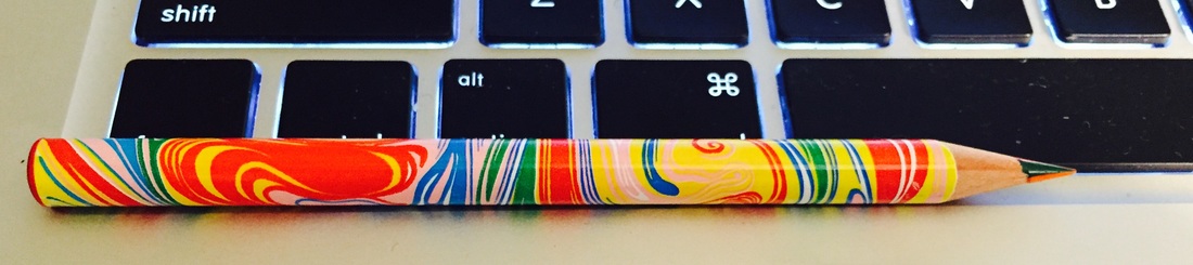 Now, just as with any art tool or supplies, â chacun son goût. We each like different things and you may prefer something I dislike. For example, I like Rainbow Lead/Multi's with fairly soft leads. You may like them with harder leads. The plain brown Rainbow Lead/Multi's in the first picture have very hard leads. I use them but they are not my favorites. I prefer the soft leads of the pencil shown just above. You may like thicker pencils which have thicker leads. I really and truly dislike those--I can't get the fine lines that I prefer, even when I sharpen the heck out of them. So I look for regular-sized pencils, not thick chunky ones. IF THEY'RE THAT HARD TO FIND, WHERE DO I LOOK? Oh, if only I could tell you. Luck is part of it. Remember to specify "Multicolor lead" or "Rainbow Lead" (try both names...sometimes they are called "Magic Lead Pencils"). Another major clue: If you are wondering about whether it's the right pencil and you notice it has an eraser on top, don't buy it. It's not a Rainbow Lead--you cannot erase them. None of them come with erasers. Here's where I have found the ones I like so far:
WHY WOULD I WANT ONE? WHAT USE ARE THEY? Good question; you might not want one! It's all a matter of taste. I adore colored pencils, especially Prismacolors and Faber-Castells, but I would put myself in the "beginner" category with using them. The same with the Rainbow/Multi's. My previous two posts (August 25 & 26) have several photographs of how I have used them with Zentangle®, and there are numerous other examples scattered through my blog. HOW DO I USE ONE? Here's what I have learned about using them so far:
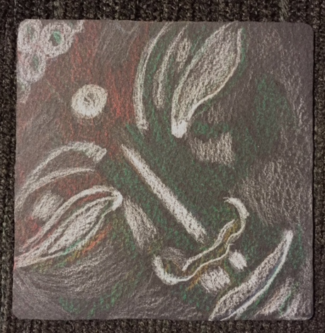
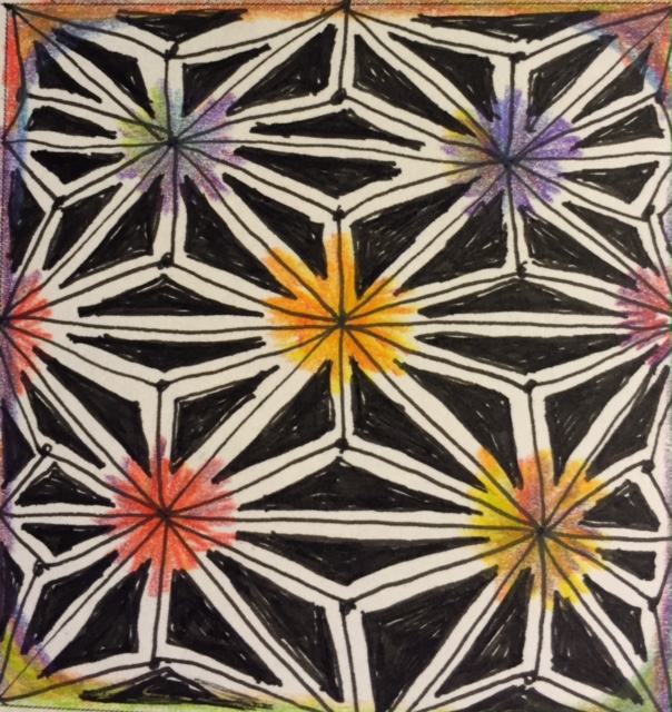
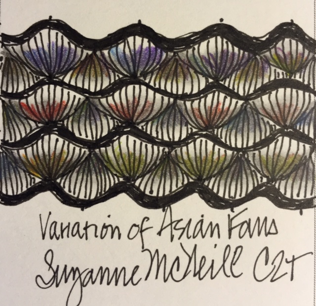
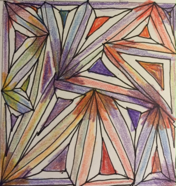
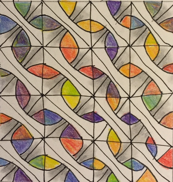
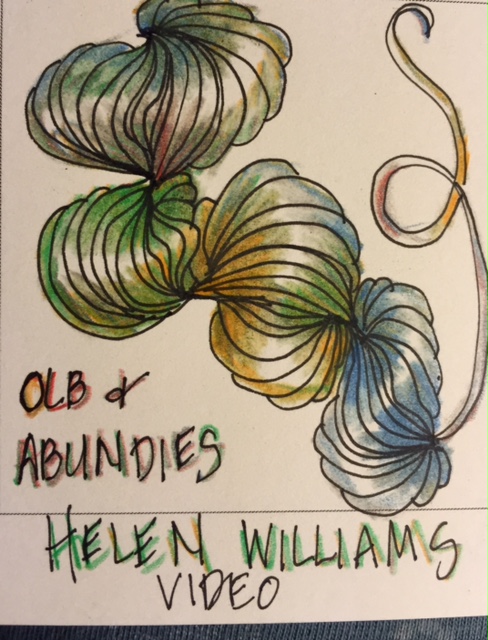
All the pieces below were colored with the Rainbow Lead Multi pencil I've been talking about. All were done in my wonderful Carole Ohl Tangle-a-Day calendar. Keep in mind that all of these are my first try at each of the tangles--I'd never drawn any of them before, and so a lot of them are more like sloppy sketches, but you can get a sense of how the Rainbow Lead pencil works. Truly, I hope those of you who are interested and haven't tried these will acquire some and try them out. I can't *wait* to see what you produce. Please share! These pencils are so underrated...they are not just for kids!
4 Comments
 A little freeform Betweed done on a black tile to begin the day. This was done with a single multicolor pencil on a black tile, with a dash of white Prismacolor for highlights. Done for the Diva Challenge, part II (see yesterday's post). Next, an entirely freeform Betweed mandala, done with the same multicolored pencil, a gray Prismacolor, and a spot of Uniball Sigma Broad White pen. 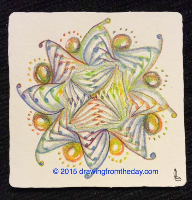 Wow, hard to believe August is coming to a close. Summer is rushing by. This week's Diva Challenge is all about meditation. It's from Holly Atwater, a CZT who has been experimenting with recording Zentangle® meditations like the one Molly created so successfully. I enjoy doing these and I thought I would give it a try, so here are the three pieces I created as a result. They were supposed to be done with regular black and white techniques, but I couldn't help using a multicolored pencil for shading. The only multicolored pencil I can now get makes shading MUCH more difficult to do; the lead is not at all soft the way good monochromatic colored pencils are. It's very hard and can't be smudged with a tortillion at all, so once you put it down on the page, it's immovable. I did the best I could--I just had to have some color... 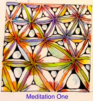 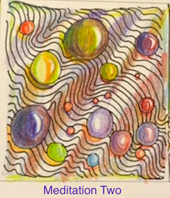 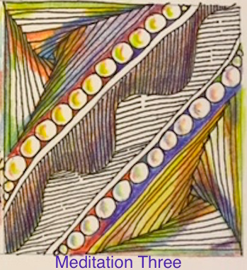 About meditation three: If you also participated in this challenge and you wonder why this looks different from yours, it's because I added Paradox in both corners. I just could not resist breaking rules for this Diva Challenge. Sorry! There is a second challenge which I haven't yet had time to do; will post that later or tomorrow, if I can get to it. Meanwhile, look what just arrived in the mail from Shutterfly--my heart mirror-tile cards from the mirror-tile I made the other day (see my original in the August 19th post). I love them! Cannot wait to inflict one on somebody. 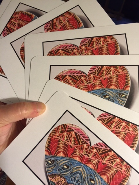 NOTE: Unless you are an art nerd, no need to read the text on this entry! I have way too many Sakura Gellyroll pens that I haven't had time to use, and before today I didn't really know how the different types differed from each other. So this afternoon I did the same tangle on 3 black tiles using 3 different types of Gellyrolls: Moonlight, Metallic, and Stardust. (The Stardust pens produced the big mystery) My thinking was that if I used the same tangle, I'd be better able to see the differences in the pens. I had a variety of colors in each of the 3 types, and hoped to use all the colors in each type on its own tile. Results: I learned a lot doing this (will spare you the lessons). But the big mystery was...where the heck did the color go when I used the different color Stardust type on that far right tile? Here's another look at just that tile, which turned out to be my favorite even though it did not have different colors...  Love that one. But the colors--??? So I asked my CZT friends about it and Donald Wilka said yes, they do disappear on the black but they show up on the white tiles and the tan tiles. Which meant, of course, I had to try them out on a white tile. But before I show you that, I liked the look of the tile above so much that I decided to run it through the mirror app on my iPhone (if you've been reading you know I'm obsessed with playing with this app) and that produced this piece below, which I also love.  I admit I am a fool for that mirror app. Finally I got around to doing a Stardust Gellyroll experiment on a white tile, and darned if Donald wasn't right. I never really doubted him, but check this out. I used the exact same pens in the same order of colors, and here is how they looked on white. 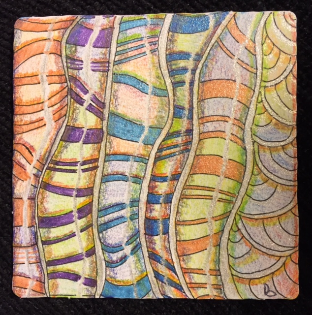 On the actual tile, they are as glittery as they look on the black--but they do not photograph with any glitter showing at all. You'll have to trust me on this. So to sum up, here are the 4 of them all lined up. All use color, but only 3 of them show color. The Stardust Gellyrolls lose their color entirely on the black tile, but I ended up liking that tile the best.  Today's work made me realize I need to do a lot more of this type of comparison. I'm inspired.
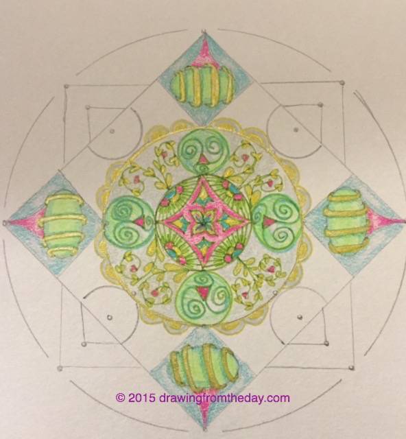
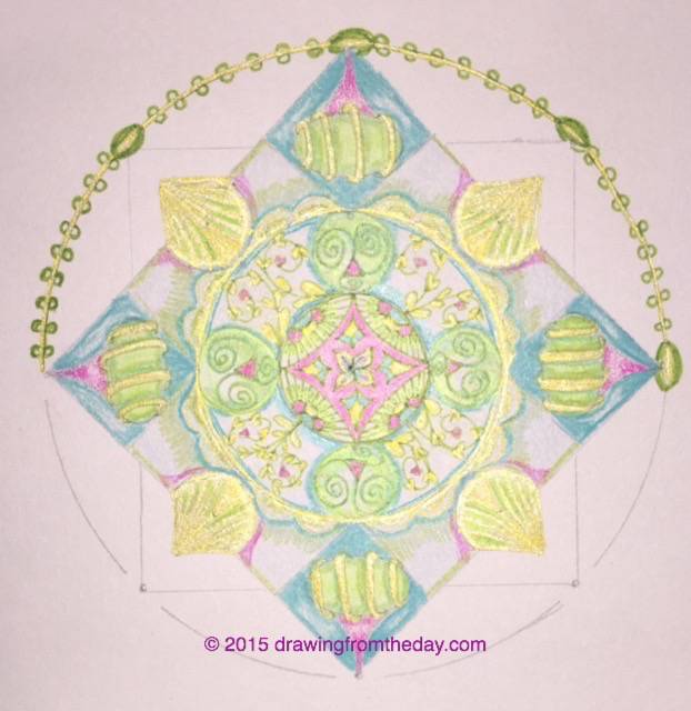
All the hot humid weather is making me cranky. Really, really cranky. I don't want to do any substantive walking outdoors or real exercise...I just want to hunker down in the a/c. So now I have an intense case of summer cabin fever. Restless to the max! I just want this heat to break so I can get out there again and M-O-V-E. I thought I would work on a black tile today since I was in a dark mood and I don't get enough practice with black tiles. It's time to put in some serious work and experimentation with them. I also have a seemingly endless supply of three different types of gellyroll pens in wild colors, and I need to learn what the difference is between the three types. Gellyrolls show up dramatically on dark tiles. Today I limited myself to a white gellyroll with white and red Prismacolor pencils to do a simple duotangle on the black tile. 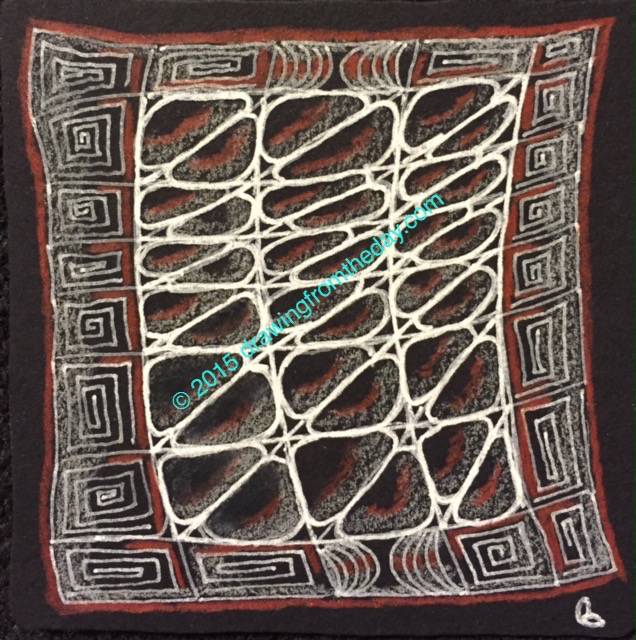 At first I just did the white-on-black, but then later added the red to reflect my impatience with the weather. Contrast this to my tile of August 12th. I think the heat wave had just begun then and I was still feeling chipper. I've been paying with the mirror app on my iPhone, and so after I did that tile and posted it, I ran it through the mirror app and came up with this:  Whoa, I love that! And talk about a different feeling from the tile I did today...I liked this so much I'm having some greeting cards made from it. That mirror app is really fun. While I'm at it, here are a few more portraits that I did long ago. These are from 2007.   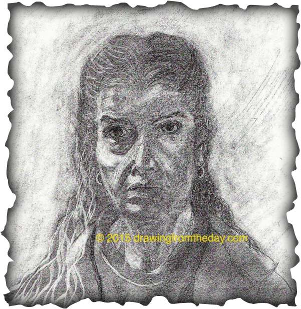 This piece is gilded, and thus so much trickier to photograph. It's much nicer in person. 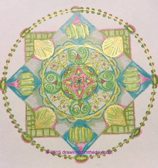 This is the fourth and final string I drew with Ann Grasso's 4n1 stencil at the fabulous class I attended with her in Cromwell, CT last month. I posted about the class previously here. Ann is just a great teacher, very organized and supportive, and while I produced four formats (aka "strings") there, it has taken me all this time to create a completed mandala in each format. After today I'm done with the class-created formats. Now I have the stencil plus other mandala-making tools, and I am curious to see what I can come up with on my own. I Of course, each of us who attended that workshop will come up with totally different and original drawings in the end. That's the fun of working this way; we all hear the same instructions, and yet it's impossible to believe that when viewing final outcomes. To see what I mean, go to photo stream on Ann's Facebook page, Ideas in Progress. Prepare to drool when you click on that link. Here are the stages this one went through. (And then of course, I have to post the "mirrored" version at the end because I just cannot resist.) And now..the mirrored version below. You know I just had to try this out, using the mirror app on my phone. 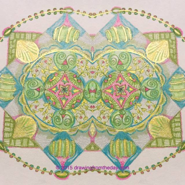 To cap off this series--and I hope it's the first of many, as I am obsessed with mandalas--here is a quote from Jung himself:
"The 'squaring of the circle' is one of the many archetypal motifs which form the basic patterns of our dreams and fantasies. But it is distinguished by the fact that it is one of the most important of them from the functional point of view. Indeed, it could even be called the archetype of wholeness.” And a lovely blog with a great quote from Pema Chodron on this topic, and many additional thoughts and drawings, is here. Have fun, and thank you for reading this far. Actually, what I truly believe is that mean people deserve our utmost sympathy--while at the same time, we need to draw clear boundaries to protect ourselves from them. Occasionally, those clear boundaries call for twenty-foot high walls to shut the mean people out altogether. How very sad that they are so twisted that they need to be mean. Even mean people deserve love, but tough love, emphasis on "tough." What got me thinking about this? Yesterday a much-loved friend was so badly mistreated by her blood relatives that it just rendered me speechless...no one should be treated like that, no one. And it's been going on for years, but yesterday was really the capper. Notice I call them her "blood relatives" and not her family. Technically, they are her family, but I wouldn't dignify them with that title. My heart was also wounded for her, as I simply cannot comprehend this behavior or why they would inflict it on her. I went back and forth from angry to sad and back again. Today, I drew this mandala: 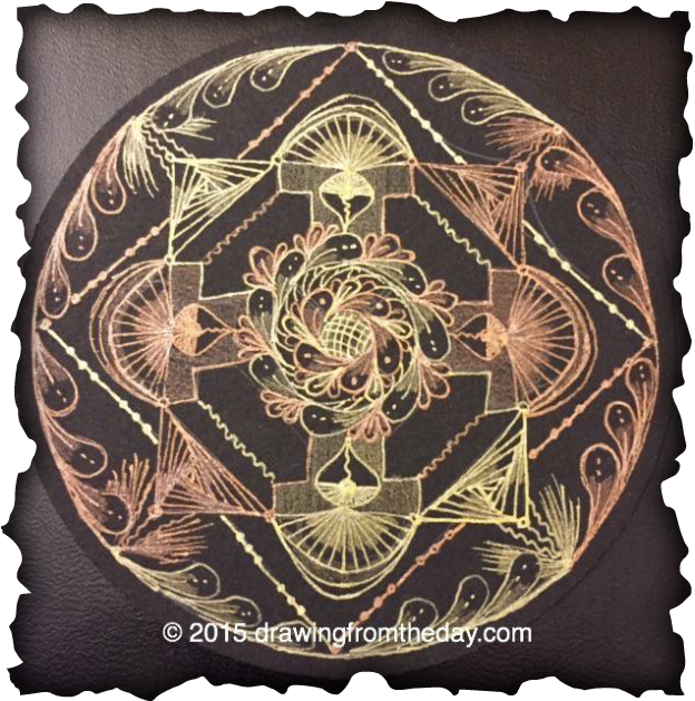 AN ALCHEMICAL MANDALA As I was drawing it, I was thinking of the art of alchemy, of turning the lead of our lives into gold. I was thinking of how badly we sometimes treat each other, and about the power of resilience. I know that my friend will regain her footing and go on with her life.
We are all, as the saying goes: "Strong at the broken places." And at the same time, we are still broken at the broken places. We manage to get up after being slapped down, and we go on with the journey. Most of the time, we even learn from our experiences and realize it's all part of maturing and getting through life. These trials and tests often teach us to recognize in advance that another one may be building, and we can skillfully step out of the way in time to deflect it. Or we learn to steer through it safely. Or we recognize that, though these attacks can feel personal, they aren't personal--and they are more about the attacker than about us. But other times we just cannot get up, the devastation is so great. We need help from our true family--our loving relatives and our friends-as-family. Even from strangers-as-family. May we all learn to give this loving help to each other when it is needed. I know I have done my share of being mean, of hurting others. Hopefully, not too much of that lately...but after watching what happened yesterday, I know I need to be very mindful to act on my desire to choose kindness. It is pretty hard to resist being mean sometimes, yes? We really want to lash out. I've done it, you've done it--it's universal. But I hope to do better now. Tough love when needed? Yes. Clear boundaries when needed? Yes. But yesterday was a powerful reminder of the need for Right Speech and Right Action. That's why I am calling today's mandala an "Alchemical Mandala," I dedicate it to my caring and kind friend, who did not deserve what she experienced yesterday. May we all be safe and protected. May we all be kind to one another. CZT Margaret Bremner, a tangling genius and one of my idols, posted a new tangle last night called Pixioze. Go ahead--click on her name and check out her wonderful website, and prepare to drool over her art. I tried it out right away, slapping it together on paper really fast and rather mindlessly while watching tv (it's on the left below). Fun! Then someone suggested that it resembled another tangle called Inaura, by CZT Bunny Wright. I didn't think I agreed, but couldn't quite remember Inaura...looked it up on tanglepatterns and saw that they are sort of kissing cousins; they have similarities, but aren't the same. So this morning I took the time to do a second, much slower and more mindful version of Pixioze (on the right below). And then, in the center, I did my version of Inaura. The result: way, way too busy, but fun anyway! I used my multicolored pencil to "shade." It's nearly impossible to shade with the multicolor, but I couldn't resist and gave it a try. Here's my too-busy art for the day. 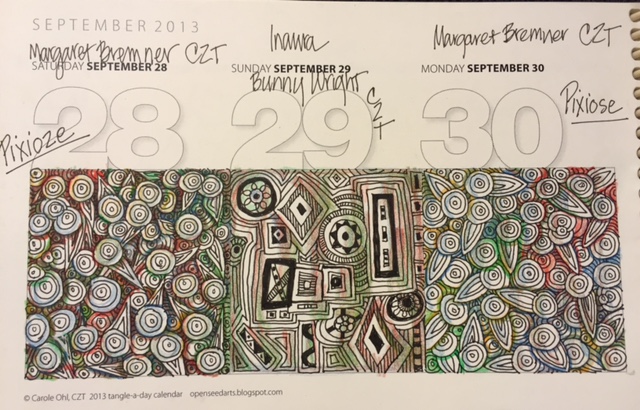 Please note I misspelled the tangle when I labeled it on the right. Correct spelling is indeed on the left: Pixioze. A combination of Pixie and "O's," which makes sense when you look at it.
Oh, how I love black. I have a black couch. I wear a lot of black. And in my art projects, I am always drawn to things with very dark backgrounds. The darker, the better. But give me a black tile to tangle on...suddenly it's not so easy! It's very strange that I hardly ever tangle on black. The paper on these tiles feels very different to me, much softer than that of the white tiles, almost "tender." I find it more challenging to work with then the white. Today I did a quick tangle-on-black in order to "warm-up" to working on the black Zendala® tile that I'll be doing next. I'm so glad I decided to begin by just practicing, rather than starting right into the Zendala tile. It's been quite a while since I have worked on a black tile and I had forgotten just about everything I ever knew. (It may be time to focus on black and Renaissance tiles for a bit.) Here is the result of my practice session today. Many mistakes, and many lessons learned! 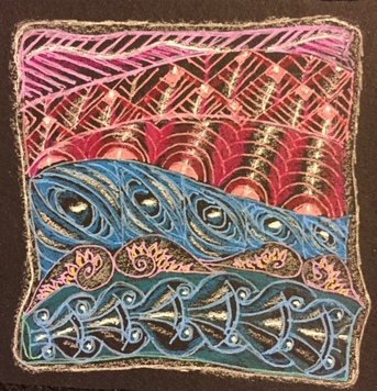 The tangles are: (top to bottom) Meer Flukes Crescent Moon Cooties Flyte (adaptation) Kringel I pulled all of them off my iPhone's Tangle Library App, created by Sandy Steen Bartholemew. I was also trying out my new Uniball Signo Angelic pens, which have a thinner line than the Uniball Signo Broad I have found in many stores. I'm liking them a lot. Also in the picture are Prismacolor pencils for some shading.
More practice definitely needed. I'm glad I chose the word "Practice" as my theme for 2015. It's working for me on every level: art, meditation, and life. Opening a file folder this morning, I found a number of ten year old sketches, neatly clipped together and blatantly misfiled. Strange, since I looked in this folder as recently as a month ago, read through it carefully, and these sketches were not there then. I do not remember coming across them recently, so how did they get in there? (Cue the "Twilight Zone" theme music here) But I was very happy to see them. What surprised me most was that they were dated June and July of 2005, and yet I still like them. They are pretty simple, but they really capture the people I was drawing. Everyone whose portrait I drew that summer was on staff at Omega. It was the first time I took Omega's annual week-long Drawing On the Right Side of the Brain workshop, which was taught by Lynda Greenberg and was superb. (You can read the book and not do the work, but in this workshop, you have to do the work.) I saw all the participants improve radically in just 5 days. The show-and-tell at the end impressed us all with the dramatic differences between day one and day five. I loved it so much I took it again a few years later. But I digress. Here was my first attempt to draw a portrait. This is a young guy named Alex who was on the Omega staff that summer, and when I ran across this sketch and the subsequent one, I found myself wondering what he looks like now, ten years later, what he is doing, and how he is faring in life. 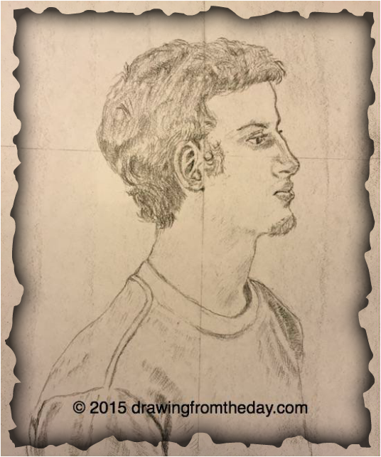 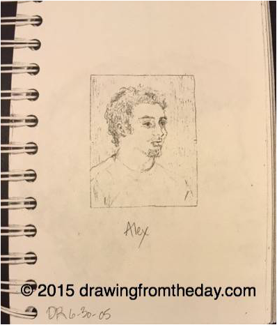 The following day we had a chance to try again, and I produced this sketch of a young woman calling herself Nola. Once again, I wonder where she is today and how she is doing. I still love this sketch. What amazed me was how much the finished pictures actually resembled their human models--they really looked like this. Although I'm hardly a Leonardo, I must say I astounded myself with this portrait and still like it a decade later. I loved every minute of drawing it too, I remember that distinctly. The world disappeared while I worked on it. Because I was apparently drawing faster than everyone else, I finished first and had time on my hands, so I snuck in another sketch while waiting, using another angle. 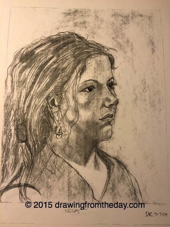 The other revelation for me was how much enjoyment I got out of doing the drawings. I remember leaving the workshop wondering if I might become a portrait artist in later life. Something that still interests me--at least, I am still interested in drawing more portraits.
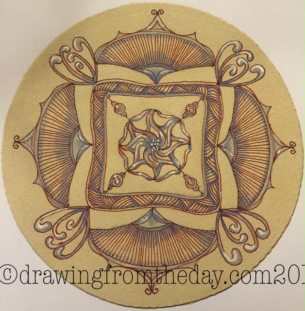
A quote from much-beloved Jimmy Durante on what we think when we see ourselves: "My nose isn't big. I just happen to have a very small head." And now here is a review of the stages of the second mandala I did with Ann Grasso's mandala creation technique. A few of these photos have been shown in previous posts, but I haven't yet showed the entire progression of this one, which I just finished today. Here's the development of this mandala. (New photos are at the end) 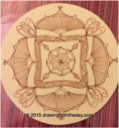 The original plain-vanilla version, but this second Zendala® was done on a Renaissance (tan) tile and so requires different techniques.
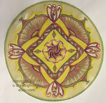
 Using another copy from my original (on more cheap copy paper), I did a fully-colored version and really liked that too, but I was realizing that cheap copies were not holding up well and after all that effort, I began to re-think using this type of paper. I was reminded that I could make copies using a much higher quality paper, and I'll do that from now on. Creating this version still left me with the original un-colored Renaissance tile. Time to color that one next... And so, I did color it yesterday, and on the rich tan printmaking Zendala® paper, I could really "go to town" in a way that the cheaper paper couldn't handle. 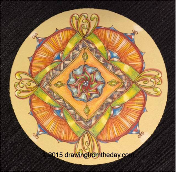 And of course, I could not let well enough alone at that point, so I got back on my iPhone and played with my Mirror App again. I can't help it. Must. Try. It. Below are two results. 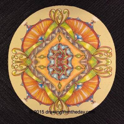 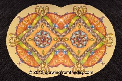 Next in this series will be the creation of a Zendala on a black tile. I haven't worked all that frequently (yet) with the black tiles. I enjoy never knowing how the drawing is going to turn out--what twists and turns the mandala shape will take as I work on it.
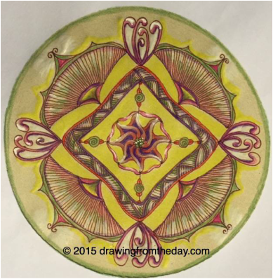
I notice I am petrified every time I begin to work on one of these, and yet working on each one, at each stage, has been incredibly calming. The fear is all in advance, and dissipates as soon as I touch pencil to paper. I am immersed in and enjoying this meditative practice, as well as the results. Let's round this off with another Mae West quote: "Anything that's worth doing is worth doing slowly." I am going to bet she was NOT talking about Zentangle there. Ya think? 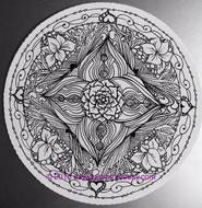 So...to review, here was the plain vanilla original, created July 21-22. I talked about it in this post (and for a few subsequent posts as I continued to develop it). 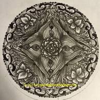 I then copied, and shaded it on regular copy paper. So far so good. 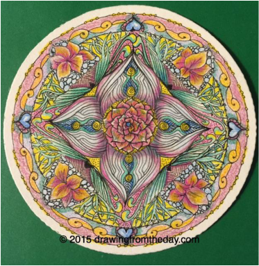 I did not want to duplicate the colors. Today I sat down and colored the actual Zentangle tile. I thought coloring deserved good paper. I didn't look at the former colored version, and couldn't really remember it. I wondered if they would come out identically, and hoped they wouldn't. And...they didn't! I am liking this a lot too. 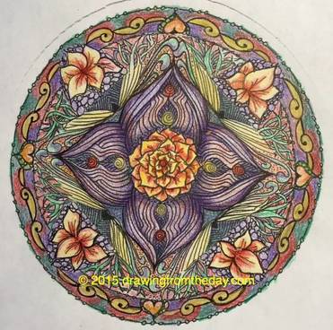 Next, I made another copy of the original, and colored that. I was liking this a lot. But I the paper was flimsy and cheap. I realized I still had the original mandala, uncolored, on the beautiful heavy expensive printmaking paper of the Zendala® tile. Did I want to copy this onto the tile itself? 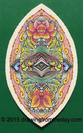 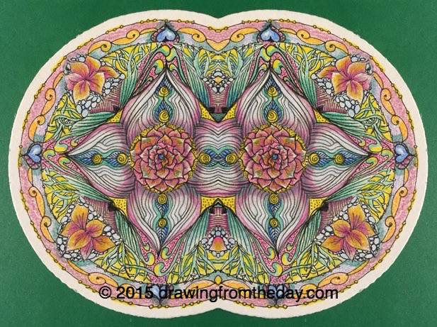 But could I leave it there? Oh no. So I pulled out my iPhone and used the Mirror App that another CZT just mentioned to me. I just got this app (it's free) and have been experimenting. (Some would say I have been ruining things...eh?) So here are two results with from the mirror app. Ok, maybe I can let this particular mandala go now! As Mae West used to say:
"Too much of a good thing...can be wonderful." I actually dreamt about coloring the mandala last night, and when I woke up very early this morning I got right to it. When I open my colored pencil holder, I never know what colors I am going to use, but in the dream I remember I was using yellow. The tile is tan--yellow on tan? Would that even work? What would it look like? Should I even try it? Well, I did; I sat down and gave it a try. Here is the result. On the left is yesterday's version, which is only shaded. Today's version is on the right, using seven different colored pencils.
By gosh, that yellow actually does show up!
I did both of these on cheap copy paper. As I mentioned yesterday I made 3 copies of the original tile to play with and left the tile itself untouched. In today's colored version at the upper left you can see some buckling of the cheap paper where it got overworked when I was applying the colors. I like it anyway. These are not "my" colors, so I'm intrigued with how they look and why I chose them. I'm also intrigued with how a 1/4 rotation of the tile, plus coloring it, makes it look so different from the shaded version of yesterday. That's what I love about this stuff--the learning never stops. My next lesson will be to get better--I hope--at using the watermark software. I keep trying different apps and so far haven't found "the one." Some days, you get outta bed and you know you just have to draw. Or at least that is true for me. I'd been putting it off for days, but I wanted to work on a mandala today, and told myself this morning that I wasn't going anywhere until I had it done. After dragging my feet a bit, I pulled out the initial string (draft format) I had created at Ann Grasso's workshop in CT last month (blogged about that here) and began to plan what I would do with it. Here's the start: 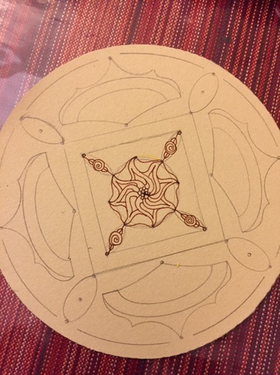 Doesn't look like much. "Fengle" is the name of that center tangle. Then a bit of free-form tangling around it. I looked at it for awhile and then added this: 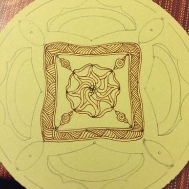 "Shattuck" is the name of that tangle. Love that one; it's a go-to for me. More looking and thinking...After some hand-wringing and trepidation, i added Citrus and a variation of Mooka, and some more free-form tangling, and ended up with this as the basic form of the mandala prior to shading: 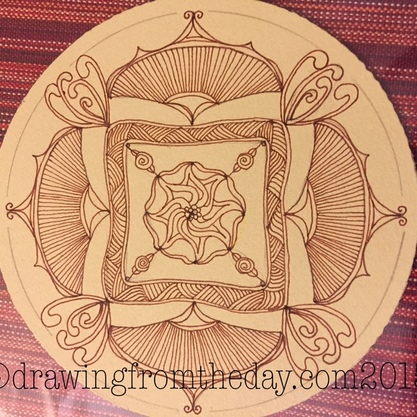 I thought I might just stop there for the day. But I couldn't leave it alone and just had to add some shading. Before shading, I made 3 copies of the basic form--one to shade, one to color later, and a spare. Here is the shaded version below.  Quite a difference, huh? I'll try coloring it next, but not today. I used a 30% cool gray Prismacolor pencil, Periwinkle Prismacolor pencil, and a Uniball Signo White pen for the shading and highlights. Plus the tile itself is tan and I did the tangling with a Brown Micron 01 pen. I really enjoyed the heck out of doing this.
I continue to be amazed at how frightened I am before I begin all of these projects, what fun they are when I am working on them, and how much I enjoy the results. I can only get better, so what have I got to lose by trying? I swear, it's an adventure and a lesson every time I sit down to work on any piece of art, even if I tell myself "It's only practice." It's all only practice, no matter what! It's similar to meditation in that way. Here's a wonderful short blog piece reinforcing that idea. |
ABOUT ME I'm a textile artist (traditional rug hooking, punch needle rug hooking, and other textile arts), a long-time meditator, a certified meditation teacher and coach, and focused on learning about the interplay of art, creativity, and mindfulness every day. 
Certified, 2021
Certified Unified Mindfulness Coach

Certified Zentangle® Teacher, 2013
Certified by AmyOxford.com at The Oxford Rug Hooking School, 2016

Categories
All
Archives
July 2024
SITES TO WATCH:
Insight Meditation Society Oxford Rug Hooking School Zentangle: The Official Site Green Mountain Rug Hooking Massachusetts Tarot Society 


|


 RSS Feed